README.md
视觉设计
DAZ3D
01-DAZ3D简介和安装
01-DAZ3D简介和安装.md
02-资源包内容管理
02-资源包内容管理.md
03-场景和物体布置
03-场景和物体布置.md
04-角色和动作
04-角色和动作.md
SketchUp
01-SketchUp简介
01-SketchUp简介.md
02-基本操作
02-基本操作.md
03-选择工具
03-选择工具.md
04-直线工具
04-直线工具.md
05-绘图工具
05-绘图工具.md
06-擦除工具
06-擦除工具.md
07-编辑工具
07-编辑工具.md
08-实体工具
08-实体工具.md
09-建筑施工工具
09-建筑施工工具.md
10-剖切面工具
10-剖切面工具.md
11-群组和组件
11-群组和组件.md
12-图层工具
12-图层工具.md
13-材质工具
13-材质工具.md
14-场景漫游
14-场景漫游.md
软件工程
3D图形学
3D数学基础
01-向量
01-向量.md
02-矩阵运算
02-矩阵运算.md
03-变换矩阵
03-变换矩阵.md
DirectX9.0
01-DX9开发环境搭建
01-DX9开发环境搭建.md
02-初始化DX9
02-初始化DX9.md
03-绘制流水线简介
03-绘制流水线简介.md
OpenGLES1.0
01-HelloWorld
01-HelloWorld.md
02-让图像转动
02-让图像转动.md
03-基本几何图元
03-基本几何图元.md
04-顶点着色
04-顶点着色.md
05-光照和材质
05-光照和材质.md
06-纹理贴图
06-纹理贴图.md
C语言
C++语言基础
C和C++混合编程
C和C++混合编程.md
友元函数和友元类
友元函数和友元类.md
堆和栈上的对象
堆和栈上的对象.md
深拷贝和浅拷贝
深拷贝和浅拷贝.md
运算符重载
运算符重载.md
C语言基础
01-基本语法
01-基本语法.md
02-函数
02-函数.md
03-分支循环
03-分支循环.md
04-数据类型
04-数据类型.md
05-结构体和联合体
05-结构体和联合体.md
06-数组
06-数组.md
07-运算符
07-运算符.md
08-指针
08-指针.md
09-高级函数应用
09-高级函数应用.md
10-C标准库
10-C标准库.md
11-堆栈和内存布局
11-堆栈和内存布局.md
12-编译预处理
12-编译预处理.md
13-链接详解
13-链接详解.md
14-静态库和共享库
14-静态库和共享库.md
15-编码风格
15-编码风格.md
LinuxC编程
Linux开发工具链
autotools-构建套件
autotools-构建套件.md
cmake-构建工具
cmake-构建工具.md
gcc-编译器
gcc-编译器.md
gdb-调试器
gdb-调试器.md
ldconfig-动态库加载管理
ldconfig-动态库加载管理.md
ldd-查询动态库依赖
ldd-查询动态库依赖.md
make-构建工具
make-构建工具.md
POSIX编程
Linux文件系统
Linux文件系统.md
socket
socket.md
信号
信号.md
文件IO
文件IO.md
线程
线程.md
进程
进程.md
Windows编程
MSVC工具链
程序库创建和使用
程序库创建和使用.md
预编译头文件
预编译头文件.md
Win32程序设计
01-Win32API入门简介
01-Win32API入门简介.md
02-字符编码详解
02-字符编码详解.md
03-窗体初始化
03-窗体初始化.md
04-消息机制
04-消息机制.md
05-资源
05-资源.md
06-GDI绘图
06-GDI绘图.md
Go语言
GORM框架
01-GORM简介
01-GORM简介.md
02-建立数据库连接
02-建立数据库连接.md
03-单表CRUD
03-单表CRUD.md
04-执行SQL语句
04-执行SQL语句.md
05-关联映射
05-关联映射.md
Gin框架
01-Gin简介和环境搭建
01-Gin简介和环境搭建.md
02-路由配置
02-路由配置.md
03-处理HTTP请求
03-处理HTTP请求.md
04-使用Cookie
04-使用Cookie.md
05-使用Session
05-使用Session.md
06-使用中间件
06-使用中间件.md
07-集成WebSocket
07-集成WebSocket.md
Go语言基础
01-Go语言简介和环境搭建
01-Go语言简介和环境搭建.md
02-工程目录结构
02-工程目录结构.md
03-常量和变量
03-常量和变量.md
04-数据类型
04-数据类型.md
05-数组
05-数组.md
06-字典
06-字典.md
07-结构体
07-结构体.md
08-分支循环语句
08-分支循环语句.md
09-函数
09-函数.md
10-面向对象
10-面向对象.md
11-错误处理
11-错误处理.md
12-协程和信道
12-协程和信道.md
Go语言标准库
bufio-带缓冲IO操作
bufio-带缓冲IO操作.md
bytes-字节切片处理包
bytes-字节切片处理包.md
encoding-编解码
encoding-编解码.md
filepath-文件路径处理
filepath-文件路径处理.md
flag-命令行参数解析
flag-命令行参数解析.md
fmt-格式化输入输出
fmt-格式化输入输出.md
io-数据IO操作
io-数据IO操作.md
os-操作系统接口
os-操作系统接口.md
sql-数据库操作
sql-数据库操作.md
strconv-字符串转换包
strconv-字符串转换包.md
strings-字符串处理包
strings-字符串处理包.md
time-时间处理
time-时间处理.md
Go语言网络编程
01-实现TCP服务端和客户端
01-实现TCP服务端和客户端.md
02-基于TCP传输二进制报文
02-基于TCP传输二进制报文.md
03-使用TLS传输层安全协议
03-使用TLS传输层安全协议.md
04-实现UDP服务端和客户端
04-实现UDP服务端和客户端.md
05-UDP广播和组播
05-UDP广播和组播.md
06-DNS解析查询
06-DNS解析查询.md
07-实现HTTP服务端
07-实现HTTP服务端.md
08-实现HTTP客户端
08-实现HTTP客户端.md
开发工具链
go命令行工具
go命令行工具.md
Java
JavaEE
BeanValidation
BeanValidation.md
JAXB
JAXB.md
JAXP
JAXP.md
JMS
01-JMS简介
01-JMS简介.md
02-点对点和发布订阅
02-点对点和发布订阅.md
03-消息类型
03-消息类型.md
04-消息选择器
04-消息选择器.md
JNDI
JNDI.md
JSF
01-JSF简介和环境搭建
01-JSF简介和环境搭建.md
02-托管Bean
02-托管Bean.md
03-视图和控件
03-视图和控件.md
04-JSF之AJAX
04-JSF之AJAX.md
05-事件处理
05-事件处理.md
JSP
01-JSP简介
01-JSP简介.md
02-JSTL标签和EL表达式
02-JSTL标签和EL表达式.md
03-自定义标签
03-自定义标签.md
JavaMail
JavaMail.md
Servlet
01-Servlet简介和工程搭建
01-Servlet简介和工程搭建.md
02-Servlet组件
02-Servlet组件.md
03-Fliter组件
03-Fliter组件.md
04-Listener组件
04-Listener组件.md
05-HTTP请求和响应
05-HTTP请求和响应.md
06-Session会话管理
06-Session会话管理.md
07-统一错误处理
07-统一错误处理.md
08-异步处理机制
08-异步处理机制.md
WebService
01-SOAP协议和JAXWS
01-SOAP协议和JAXWS.md
02-RESTful和JAXRS
02-RESTful和JAXRS.md
03-基于SpringBoot使用CXF框架
03-基于SpringBoot使用CXF框架.md
WebSocket
WebSocket.md
JavaFX
01-JavaFX简介和环境搭建
01-JavaFX简介和环境搭建.md
02-开发流程和HelloWorld
02-开发流程和HelloWorld.md
03-窗体和场景
03-窗体和场景.md
04-布局容器和组件
04-布局容器和组件.md
05-事件机制
05-事件机制.md
06-数据绑定
06-数据绑定.md
07-多线程和后台服务
07-多线程和后台服务.md
JavaSE
FlowAPI-响应式流
FlowAPI-响应式流.md
JDBC-数据库接口
JDBC-数据库接口.md
JMX-管理接口
JMX-管理接口.md
JUL-日志模块
JUL-日志模块.md
RMI-远程方法调用
RMI-远程方法调用.md
Swing图形界面程序开发
01-Swing框架概述
01-Swing框架概述.md
02-JFrame顶层窗口
02-JFrame顶层窗口.md
03-界面布局
03-界面布局.md
04-JDialog对话框
04-JDialog对话框.md
05-Pane窗格
05-Pane窗格.md
06-事件处理
06-事件处理.md
07-Graphics绘制2D图形
07-Graphics绘制2D图形.md
08-LookAndFeel观感
08-LookAndFeel观感.md
正则表达式
正则表达式.md
集合类
集合类.md
Java企业级应用框架
Activiti
01-Activiti简介
01-Activiti简介.md
02-使用入门
02-使用入门.md
03-流程图设计器
03-流程图设计器.md
04-BPMN流程规范
04-BPMN流程规范.md
05-流程部署管理
05-流程部署管理.md
06-集成任务表单
06-集成任务表单.md
07-用户管理
07-用户管理.md
08-查询API
08-查询API.md
09-整合Spring
09-整合Spring.md
Hibernate
00-Hibernate之坑
00-Hibernate之坑.md
01-Hibernate框架环境搭建
01-Hibernate框架环境搭建.md
02-持久化对象详解
02-持久化对象详解.md
03-关联映射
03-关联映射.md
04-HQL查询
04-HQL查询.md
05-配置缓存和连接池
05-配置缓存和连接池.md
MyBatis
01-MyBatis简介和工程搭建
01-MyBatis简介和工程搭建.md
02-增删改查
02-增删改查.md
03-动态SQL
03-动态SQL.md
04-关联查询
04-关联查询.md
05-MyBatis缓存配置
05-MyBatis缓存配置.md
06-使用注解配置Mapper
06-使用注解配置Mapper.md
07-tkmybatis-功能扩展
07-tkmybatis-功能扩展.md
Netty
01-Netty入门简介
01-Netty入门简介.md
02-TCP长连接服务器
02-TCP长连接服务器.md
03-心跳检测和断线重连
03-心跳检测和断线重连.md
04-基于protobuf设计消息报文
04-基于protobuf设计消息报文.md
05-WebSocket服务器
05-WebSocket服务器.md
Quartz
01-Quartz简介和使用
01-Quartz简介和使用.md
02-Job任务
02-Job任务.md
03-Trigger触发器
03-Trigger触发器.md
04-Scheduler调度器
04-Scheduler调度器.md
05-Spring框架集成
05-Spring框架集成.md
ShardingSphere
01-ShardingSphere简介
01-ShardingSphere简介.md
02-ShardingJDBC
02-ShardingJDBC.md
03-ShardingProxy
03-ShardingProxy.md
Shiro
01-Shiro简介
01-Shiro简介.md
02-认证和鉴权
02-认证和鉴权.md
03-Realm安全信息域
03-Realm安全信息域.md
04-SpringMVC整合
04-SpringMVC整合.md
05-SpringBoot整合
05-SpringBoot整合.md
Spring
SpringBoot
01-SpringBoot简介和工程搭建
01-SpringBoot简介和工程搭建.md
02-工程配置
02-工程配置.md
03-起步依赖
03-起步依赖.md
04-Actuator
05-Actuator.md
05-单元测试
07-单元测试.md
06-工程部署
06-工程部署.md
07-常见问题总结
07-常见问题总结.md
SpringCloud
01-SpringCloud微服务简介
01-SpringCloud微服务简介.md
02-Consul服务发现和分布式配置
02-Consul服务发现和分布式配置.md
03-OpenFeign声明式服务调用
03-OpenFeign声明式服务调用.md
04-CircuitBreaker断路器
04-CircuitBreaker断路器.md
05-Gateway微服务网关
05-Gateway微服务网关.md
06-Bus消息总线
06-Bus消息总线.md
07-Sleuth链路跟踪
07-Sleuth链路跟踪.md
SpringCloudAlibaba
01-SpringCloudAlibaba简介
01-SpringCloudAlibaba简介.md
02-Nacos服务发现和分布式配置
02-Nacos服务发现和分布式配置.md
03-Sentinel限流熔断降级
03-Sentinel限流熔断降级.md
SpringData
SpringDataJPA
SpringDataJPA.md
SpringDataRedis
SpringDataRedis.md
SpringFramework
Core
01-Spring框架简介
01-Spring框架简介.md
02-IoC容器和依赖注入
02-IoC容器和依赖注入.md
03-Bean装配
03-Bean装配.md
04-生命周期和扩展点
04-生命周期和扩展点.md
05-AOP面向切面编程
05-AOP面向切面编程.md
06-SpEL表达式
06-SpEL表达式.md
07-Event事件机制
07-Event事件机制.md
08-Resource资源类型
08-Resource资源类型.md
09-Utils工具类
09-Utils工具类.md
Data
JdbcTemplate
JdbcTemplate.md
事务管理器
事务管理器.md
Integration
SpringCache
SpringCache.md
计划任务
计划任务.md
SpringMVC
01-SpringMVC简介和环境搭建
01-SpringMVC简介和环境搭建.md
02-Controller控制器
02-Controller控制器.md
03-Interceptor拦截器
03-Interceptor拦截器.md
04-内置过滤器
04-内置过滤器.md
05-CORS跨域配置
05-CORS跨域配置.md
06-URI创建工具类
06-URI创建工具类.md
07-集成Thymeleaf模板引擎
07-集成Thymeleaf模板引擎.md
08-使用WebSocket
08-使用WebSocket.md
SpringWebFlux
01-SpringWebFlux简介
01-SpringWebFlux简介.md
02-Reactor反应式编程
02-Reactor反应式编程.md
03-Controller模式服务
03-Controller模式服务.md
04-RouterFunction模式服务
04-RouterFunction模式服务.md
05-WebFilter过滤器
05-WebFilter过滤器.md
SpringSecurity
01-SpringSecurity简介
01-SpringSecurity简介.md
02-架构和核心流程
02-架构和核心流程.md
03-认证
03-认证.md
04-鉴权
04-鉴权.md
05-错误处理
05-错误处理.md
SpringSession
SpringSession.md
Struts2
01-Struts2简介
01-Struts2简介.md
02-配置文件详解
02-配置文件详解.md
03-Action类和结果视图
03-Action类和结果视图.md
04-处理HTTP请求
04-处理HTTP请求.md
05-表单处理和数据类型转换
05-表单处理和数据类型转换.md
06-表单验证
06-表单验证.md
07-拦截器
07-拦截器.md
08-文件上传和下载
08-文件上传和下载.md
09-值栈和OGNL表达式
09-值栈和OGNL表达式.md
10-Struts2通用标签
10-Struts2通用标签.md
11-整合Spring和Struts2
11-整合Spring和Struts2.md
Java构建和开发工具链
Gradle
01-Gradle安装和配置
01-Gradle安装和配置.md
02-Groovy语言简介
02-Groovy语言简介.md
03-Gradle构建框架
03-Gradle构建框架.md
Maven
01-Maven简介和安装
01-Maven简介和安装.md
02-pom配置文件
02-pom配置文件.md
03-构建生命周期
03-构建生命周期.md
archetype插件-自定义项目骨架
archetype插件-自定义项目骨架.md
resource插件-资源文件处理
resource插件-资源文件处理.md
versions插件-配置构件版本
versions插件-配置构件版本.md
发布包到Nexus私服
发布包到Nexus私服.md
常见问题处理
常见问题处理.md
根据部署环境自动打包
根据部署环境自动打包.md
命令行工具
arthas-监控诊断工具
arthas-监控诊断工具.md
javap-反编译工具
javap-反编译工具.md
jconsole-监控面板
jconsole-监控面板.md
jinfo-配置信息管理
jinfo-配置信息管理.md
jmap-堆快照工具
jmap-堆快照工具.md
jps-虚拟机进程查看
jps-虚拟机进程查看.md
jstack-线程栈分析工具
jstack-线程栈分析工具.md
jstat-虚拟机信息统计
jstat-虚拟机信息统计.md
临时切换Java版本
临时切换Java版本.md
Java虚拟机
01-JVM架构简介
01-JVM架构简介.md
02-类加载子系统
02-类加载子系统.md
03-程序计数器
03-程序计数器.md
04-虚拟机栈区
04-虚拟机栈区.md
05-堆内存区
05-堆内存区.md
06-方法区
06-方法区.md
07-直接内存
07-直接内存.md
08-执行引擎
08-执行引擎.md
09-垃圾收集器
09-垃圾收集器.md
Java语言基础
BigDecimal
BigDecimal.md
CLASSPATH详解
CLASSPATH详解.md
Java8新特性
01-Lambda表达式
01-Lambda表达式.md
02-函数式接口
02-函数式接口.md
03-StreamAPI流式数据处理
03-StreamAPI流式数据处理.md
04-Optional类
04-Optional类.md
05-CompletableFuture异步编程
05-CompletableFuture异步编程.md
Java并发程序设计
01-Thread线程类
01-Thread线程类.md
02-线程同步代码块
02-线程同步代码块.md
03-volatile变量
03-volatile变量.md
04-原子类
04-原子类.md
05-线程停止
05-线程停止.md
06-等待通知机制
06-等待通知机制.md
07-ThreadLocal线程局部变量
07-ThreadLocal线程局部变量.md
08-Lock多线程锁
08-Lock多线程锁.md
09-线程安全集合类
09-线程安全集合类.md
10-Callable和Future接口
10-Callable和Future接口.md
11-多线程同步器
11-多线程同步器.md
12-阻塞队列
12-阻塞队列.md
13-ThreadPool线程池
13-ThreadPool线程池.md
14-ForkJoin框架
14-ForkJoin框架.md
15-TimerTask计划任务
15-TimerTask计划任务.md
Java网络和IO程序设计
HttpServer-HTTP服务器
HttpServer-HTTP服务器.md
HttpURLConnection-HTTP客户端
HttpURLConnection-HTTP客户端.md
NIO-新的IO操作API
NIO-新的IO操作API.md
Socket-网络通信
Socket-网络通信.md
Linux下Java环境搭建
Linux下Java环境搭建.md
反射机制
反射机制.md
异常机制详解
异常机制详解.md
弱引用
弱引用.md
模块化
模块化.md
类初始化块的执行顺序
类初始化块的执行顺序.md
迭代器
迭代器.md
第三方库
JUnit5-单元测试框架
JUnit5-单元测试框架.md
Jasypt-配置文件加密
Jasypt-配置文件加密.md
Lettuce-Redis客户端
Lettuce-Redis客户端.md
Logback-日志模块
Logback-日志模块.md
Lombok-简化冗余代码
Lombok-简化冗余代码.md
Lucene-全文检索引擎
Lucene-全文检索引擎.md
OpenFeign-声明式HTTP客户端
OpenFeign-声明式HTTP客户端.md
POI-读写Excel文档
POI-读写Excel文档.md
RxJava响应式编程
01-异步回调函数
01-异步回调函数.md
02-RxJava简介
02-RxJava简介.md
03-简洁的代码
03-简洁的代码.md
04-线程控制
04-线程控制.md
05-事件队列变换
05-事件队列变换.md
06-异步并发请求
06-异步并发请求.md
SpringDoc-接口文档管理
SpringDoc-接口文档管理.md
commons-beanutils-对象属性处理
commons-beanutils-对象属性处理.md
commons-codec-编解码库
commons-codec-编解码库.md
commons-collections4-集合操作
commons-collections4-集合操作.md
commons-compress-压缩文件处理
commons-compress-压缩文件处理.md
commons-io-输入输出处理
commons-io-输入输出处理.md
commons-lang3-基础工具类
commons-lang3-基础工具类.md
groovy-整合脚本引擎
groovy-整合脚本引擎.md
httpclient5-通用HTTP客户端
httpclient5-通用HTTP客户端.md
jackson-json解析库
jackson-json解析库.md
jodconverter-文档转换
jodconverter-文档转换.md
redisson-分布式内存数据网格
01-Redisson简介和连接配置
01-Redisson简介和连接配置.md
02-分布式对象
02-分布式对象.md
03-分布式锁
03-分布式锁.md
04-SpringBoot工程集成
04-SpringBoot工程集成.md
velocity-模板引擎
01-Velocity简介
01-Velocity简介.md
02-VTL语法
02-VTL语法.md
03-配置文件
03-配置文件.md
04-toolbox工具箱
04-toolbox工具箱.md
05-整合SpringMVC
05-整合SpringMVC.md
Linux
BashShell
01-shell脚本和变量定义
01-shell脚本和变量定义.md
02-数组
02-数组.md
03-输入输出
03-输入输出.md
04-变量操作
04-变量操作.md
05-重定向和管道
05-重定向和管道.md
06-运算符
06-运算符.md
07-字符串
07-字符串.md
08-判断
08-判断.md
09-循环
09-循环.md
10-函数
10-函数.md
11-文件包含
11-文件包含.md
Linux操作系统基础
Linux命令格式
Linux命令格式.md
Linux系统启动过程
Linux系统启动过程.md
Unix权限系统
Unix权限系统.md
capability内核能力位
capability内核能力位.md
chroot隔离环境配置
chroot隔离环境配置.md
hostname主机名
hostname主机名.md
RaspberryPi
01-树莓派简介及入门
01-树莓派简介及入门.md
基于Transmission搭建下载机
基于Transmission搭建下载机.md
基于motion搭建监控系统
基于motion搭建监控系统.md
命令行工具
apt-包管理工具
apt-包管理工具.md
aria2-文件下载器
aria2-文件下载器.md
awk-文本处理
awk-文本处理.md
base64-编解码工具
base64-编解码工具.md
cat-输出文件内容
cat-输出文件内容.md
curl-HTTP客户端
curl-HTTP客户端.md
man-手册页
man-手册页.md
md5sum-散列值计算
md5sum-散列值计算.md
nc-网络测试工具
nc-网络测试工具.md
proxychains-命令行代理
proxychains-命令行代理.md
tail-查阅日志
tail-查阅日志.md
tar-归档压缩
tar-归档压缩.md
vim-文本编辑器
vim-文本编辑器.md
zsh-终极shell
zsh-终极shell.md
服务配置管理
bind-DNS服务
bind-DNS服务.md
cron-计划任务
cron-计划任务.md
dante-Socks5服务器
dante-Socks5服务器.md
nfs-网络文件系统
nfs-网络文件系统.md
rsync-文件同步服务
rsync-文件同步服务.md
samba-文件共享
samba-文件共享.md
systemctl-服务管理
systemctl-服务管理.md
vsftpd-FTP文件服务
vsftpd-FTP文件服务.md
系统配置管理
文件和文件系统管理命令
file-查看文件类型
file-查看文件类型.md
ln-创建链接
ln-创建链接.md
ls-显示文件
ls-显示文件.md
touch-创建文件
touch-创建文件.md
存储介质分区和格式化
存储介质分区和格式化.md
开机自动挂载硬盘
开机自动挂载硬盘.md
查找文件
查找文件.md
系统监控和设置命令
df-查看磁盘占用
df-查看磁盘占用.md
export-设置环境变量
export-设置环境变量.md
free-查看内存使用
free-查看内存使用.md
iotop-查看进程磁盘占用率
iotop-查看进程磁盘占用率.md
lspci-显示总线信息
lspci-显示总线信息.md
sysv-rc-conf启动级别配置
sysv-rc-conf启动级别配置.md
top-查看系统资源占用率
top-查看系统资源占用率.md
uname-系统信息
uname-系统信息.md
网络监控和配置命令
iptables-配置防火墙
iptables-配置防火墙.md
ping-网络连通性测试
ping-网络连通性测试.md
traceroute-数据包路径探测
traceroute-数据包路径探测.md
进程与作业控制命令
nice-调整进程优先级
nice-调整进程优先级.md
ps-进程状态
ps-进程状态.md
进程前后台切换
进程前后台切换.md
NodeJS
Express框架
01-Express简介和环境搭建
01-Express简介和环境搭建.md
02-路由配置
02-路由配置.md
03-处理HTTP请求
03-处理HTTP请求.md
04-使用Cookie
04-使用Cookie.md
05-使用Session
05-使用Session.md
06-中间件
06-中间件.md
07-ejs模板引擎
07-ejs模板引擎.md
NodeJS基础
01-NodeJS简介和环境搭建
01-NodeJS简介和环境搭建.md
02-工程目录结构
02-工程目录结构.md
03-模块机制
03-模块机制.md
NodeJS核心模块
events-事件系统
events-事件系统.md
fs-操作文件系统
fs-操作文件系统.md
path-文件路径处理
path-文件路径处理.md
url-网址解析
url-网址解析.md
第三方模块
log4js-日志库
log4js-日志库.md
pm2-服务进程管理
pm2-服务进程管理.md
PHP
Laravel
01-Laravel开发环境搭建
01-Laravel开发环境搭建.md
02-控制器组件
02-控制器组件.md
03-HTTP请求和响应
03-HTTP请求和响应.md
04-Cookie和Session
04-Cookie和Session.md
05-路由
05-路由.md
06-表单验证
06-表单验证.md
07-拦截器组件
07-拦截器组件.md
08-错误处理
08-错误处理.md
09-日志
09-日志.md
10-数据库
10-数据库.md
Eloquent01-模型定义
eloquent01-模型定义.md
Eloquent02-增删改查
eloquent02-增删改查.md
Eloquent03-模型关联
eloquent03-模型关联.md
artisan-命令行
artisan-命令行.md
auth-登录认证系统
auth-登录认证系统.md
debugbar-调试信息输出
debugbar-调试信息输出.md
flysystem-文件系统
flysystem-文件系统.md
PHP网络应用开发
01-处理表单
01-处理表单.md
02-Cookie和Session
02-Cookie和Session.md
03-转发和重定向
03-转发和重定向.md
04-处理异步请求和Json
04-处理异步请求和Json.md
05-请求路由
05-请求路由.md
06-连接MySQL数据库
06-连接MySQL数据库.md
PHP语言基础
01-环境搭建
01-环境搭建.md
02-基本语法
02-基本语法.md
03-代码控制流程
03-代码控制流程.md
04-数组
04-数组.md
05-函数
05-函数.md
06-类和对象
06-类和对象.md
07-命名空间
07-命名空间.md
开发工具
composer包管理工具
composer包管理工具.md
扩展库
连接redis
连接redis.md
Python
Django
01-Django简介和环境搭建
01-Django简介和环境搭建.md
02-数据模型ORM
02-数据模型ORM.md
03-结果集分页
03-结果集分页.md
04-处理HTTP请求和响应
04-处理HTTP请求和响应.md
05-使用模板显示数据
05-使用模板显示数据.md
06-使用Cookie和Session
06-使用Cookie和Session.md
07-中间件
07-中间件.md
08-定制错误页面
08-定制错误页面.md
09-Django部署
09-Django部署.md
admin-后台数据模型管理
admin-后台数据模型管理.md
auth-登陆和鉴权
auth-登陆和鉴权.md
drf-接口开发框架
drf-接口开发框架.md
logging-应用日志
logging-应用日志.md
mail-发送邮件
mail-发送邮件.md
message-消息
message-消息.md
simple-captcha验证码
simple-captcha验证码.md
常见问题
常见问题.md
FastAPI
01-FastAPI简介和环境搭建
01-FastAPI简介和环境搭建.md
02-创建路由
02-创建路由.md
03-处理HTTP请求
03-处理HTTP请求.md
04-中间件
04-中间件.md
05-后台任务
05-后台任务.md
06-提供静态文件
提供静态文件.md
LangChain
01-LangChain简介
01-LangChain简介.md
02-实现聊天机器人
02-实现聊天机器人.md
03-检索增强生成RAG
03-检索增强生成RAG.md
Python语言基础
01-Python简介和环境搭建
01-Python简介和环境搭建.md
02-变量和基本数据类型
02-变量和基本数据类型.md
03-字符串和编码
03-字符串和编码.md
04-容器类型
04-容器类型.md
05-切片
05-切片.md
06-分支循环语句
06-分支循环语句.md
07-函数
07-函数.md
08-迭代器
08-迭代器.md
09-生成式和生成器
09-生成式和生成器.md
10-装饰器
10-装饰器.md
11-面向对象编程
11-面向对象编程.md
12-包和模块
12-包和模块.md
13-异常处理
13-异常处理.md
Scrapy爬虫框架
01-Scrapy简介和环境搭建
01-Scrapy简介和环境搭建.md
02-命令行工具详解
02-命令行工具详解.md
03-Spider
03-Spider.md
04-Items数据实体类
04-Items数据实体类.md
05-ItemPipeline
05-ItemPipeline.md
06-settings配置文件
06-settings配置文件.md
内置库
argparse命令行参数解析
argparse命令行参数解析.md
base64编解码库
base64编解码库.md
json解析库
json解析库.md
开发相关工具
JupyterLab-集成开发环境
JupyterLab-集成开发环境.md
pip-包管理工具
pip-包管理工具.md
venv-虚拟环境
venv-虚拟环境.md
第三方库
APScheduler-计划任务
APScheduler-计划任务.md
PyYAML-YAML解析
PyYAML-YAML解析.md
markdown-md编译器
markdown-md编译器.md
pydantic-数据模型验证库
pydantic-数据模型验证库.md
pytest-单元测试
pytest-单元测试.md
requests-HTTP客户端
requests-HTTP客户端.md
Qt
QtQuick2
01-QtQuick简介和环境搭建
01-QtQuick简介和环境搭建.md
Qt应用程序开发基础
01-Qt简介和环境搭建
01-Qt简介和环境搭建.md
02-创建UI界面
02-创建UI界面.md
03-信号槽机制
03-信号槽机制.md
04-资源文件
04-资源文件.md
05-主窗口QMainWindow
05-主窗口QMainWindow.md
06-对话框
06-对话框.md
07-鼠标和键盘事件
07-鼠标和键盘事件.md
08-字符串和容器工具类
08-字符串和容器工具类.md
09-图形绘制
09-图形绘制.md
10-磁盘文件IO
10-磁盘文件IO.md
11-网络通信
11-网络通信.md
12-处理Json
12-处理Json.md
13-使用数据库
13-使用数据库.md
14-多线程
14-多线程.md
Web前端
Web客户端编程
EcmaScript6
Class类定义
Class类定义.md
EcmaScript6简介
EcmaScript6简介.md
Symbol类型
Symbol类型.md
let和const声明变量和常量
let和const声明变量和常量.md
函数扩展
函数扩展.md
对象扩展
对象扩展.md
异步编程之Generator函数
异步编程之Generator函数.md
异步编程之Promise对象
异步编程之Promise对象.md
异步编程之async函数
异步编程之async函数.md
模块化机制
模块化机制.md
解构赋值
解构赋值.md
Electron
01-Electron简介
01-Electron简介.md
02-Electron工程搭建
02-Electron工程搭建.md
03-主进程和渲染进程
03-主进程和渲染进程.md
04-磁盘文件IO
04-磁盘文件IO.md
05-使用数据库
05-使用数据库.md
06-HTTP网络通信
06-HTTP网络通信.md
07-窗体
07-窗体.md
08-系统功能
08-系统功能.md
09-打包发布
09-打包发布.md
HTML5
CanvasAPI
CanvasAPI.md
DragDropAPI
DragDropAPI.md
FetchAPI
FetchAPI.md
FileAPI
FileAPI.md
FormDataAPI
FormDataAPI.md
GeolocationAPI
GeolocationAPI.md
Image
Image.md
IndexedDB
IndexedDB.md
Notification
Notification.md
SSE服务端推送
SSE服务端推送.md
VideoAudio
VideoAudio.md
WebSQL
WebSQL.md
WebSocket
WebSocket.md
WebStorage
WebStorage.md
WebWorker
WebWorker.md
增强表单
增强表单.md
浏览器同源策略
浏览器同源策略.md
JQuery
01-JQuery介绍
01-JQuery介绍.md
02-JQuery选择器和DOM操作
02-JQuery选择器和DOM操作.md
03-JQuery特效
03-JQuery特效.md
04-JQueryAjax
04-JQueryAjax.md
05-JQuery插件开发
05-JQuery插件开发.md
JavaScript客户端编程
AJAX异步请求
AJAX异步请求.md
BOM接口
BOM接口.md
DOM扩展
DOM扩展.md
htmlDOM接口
htmlDOM接口.md
事件处理详解
事件处理详解.md
使用JSON
使用JSON.md
JavaScript语言精粹
01-语法
01-语法.md
02-对象
02-对象.md
03-函数
03-函数.md
04-继承
04-继承.md
05-数组
05-数组.md
06-基本类型的方法集
06-基本类型的方法集.md
NextJS
01-NextJS简介和工程搭建
01-NextJS简介和工程搭建.md
02-AppRouter路由
02-AppRouter路由.md
03-混合渲染模式
03-混合渲染模式.md
04-Fetch获取数据
04-Fetch获取数据.md
05-样式加载
05-样式加载.md
06-实现服务端逻辑
06-实现服务端逻辑.md
07-中间件
07-中间件.md
08-构建部署
08-构建部署.md
React
01-React框架简介
01-React框架简介.md
02-基础工程搭建
02-基础工程搭建.md
03-函数式组件
03-函数式组件.md
04-JSX文件
04-JSX文件.md
05-事件处理
05-事件处理.md
06-数据传递和方法调用
06-数据传递和方法调用.md
07-使用表单
07-使用表单.md
08-Hooks函数
08-Hooks函数.md
09-CSS样式
09-CSS样式.md
10-前端路由
10-前端路由.md
11-请求数据管理
11-请求数据管理.md
12-Redux状态数据流管理模型
12-Redux状态数据流管理模型.md
13-使用ReduxToolKit
13-使用ReduxToolKit.md
TypeScript
01-环境搭建
01-环境搭建.md
02-数据类型
02-数据类型.md
03-接口和类
03-接口和类.md
04-函数
04-函数.md
05-泛型
05-泛型.md
06-命名空间
06-命名空间.md
07-装饰器
07-装饰器.md
08-模块
08-模块.md
UmiJS
01-UmiJS简介
01-UmiJS简介.md
02-工程目录结构
02-工程目录结构.md
03-工程配置文件
03-工程配置文件.md
04-使用样式预处理器
04-使用样式预处理器.md
05-声明式路由
05-声明式路由.md
06-Mock模拟接口
06-Mock模拟接口.md
07-后端接口反向代理
07-后端接口反向代理.md
08-构建发布
08-构建发布.md
09-使用内置插件
09-使用内置插件.md
model-数据流插件
model-数据流插件.md
request-请求插件
request-请求插件.md
Vue
01-Vue简介
01-Vue简介.md
02-Vue组件化简介
02-Vue组件化简介.md
03-Vue组件使用详解
03-Vue组件使用详解.md
03-常用指令
03-常用指令.md
04-表单输入绑定
04-表单输入绑定.md
05-Vue中的事件
05-Vue中的事件.md
06-管道
06-管道.md
08-路由
08-路由.md
09-使用Vuex
09-使用Vuex.md
WebExtension
开发环境搭建
开发环境搭建.md
常用功能实现
JavaScript加载顺序
JavaScript加载顺序.md
判断客户端设备
判断客户端设备.md
和页面顶部的绝对间距
和页面顶部的绝对间距.md
多行省略的实现
多行省略的实现.md
悬浮弹出菜单
悬浮弹出菜单.md
浏览器反调试
浏览器反调试.md
浏览器缓存机制
浏览器缓存机制.md
纯前端路由
纯前端路由.md
获取IE版本
获取IE版本.md
返回顶部
返回顶部.md
常用库
axios-异步请求库
axios-异步请求库.md
ckeditor-富文本编辑器
ckeditor-富文本编辑器.md
crossenv-设置环境变量
crossenv-设置环境变量.md
momentjs-日期处理
momentjs-日期处理.md
prettier-代码格式化
prettier-代码格式化.md
开发工具链
YUIProcessor
YUIProcessor.md
gulp
gulp.md
jsdoc
jsdoc.md
npm
npm.md
nvm
nvm.md
webpack
01-webpack简介和安装
01-webpack简介和安装.md
02-使用webpack打包工程
02-使用webpack打包工程.md
03-使用devServer进行开发
03-使用devServer进行开发.md
yarn
yarn.md
Web网页设计
Bootstrap4
01-简介和环境搭建
01-简介和环境搭建.md
02-布局
02-布局.md
03-排版
03-排版.md
04-组件
04-组件.md
CSS
3D效果
3D效果.md
CSS工程项目搭建
CSS工程项目搭建.md
使用变量
使用变量.md
关键帧动画
关键帧动画.md
字体设置
字体设置.md
布局
布局.md
滚动条样式
滚动条样式.md
滤镜
滤镜.md
背景设置
背景设置.md
过渡特效
过渡特效.md
长度单位
长度单位.md
阴影特效
阴影特效.md
颜色
颜色.md
Less
01-Less简介和环境搭建
01-Less简介和环境搭建.md
02-Less语法
02-Less语法.md
03-引入和命名空间
03-引入和命名空间.md
TailwindCSS
01-TailwindCSS简介
01-TailwindCSS简介.md
02-使用原子类
02-使用原子类.md
03-响应式布局
03-响应式布局.md
04-暗黑模式
04-暗黑模式.md
05-可复用性
05-可复用性.md
常用库
amimatecss-动画库
amimatecss-动画库.md
fontawesome-图标库
fontawesome-图标库.md
使用Google材料设计图标
使用Google材料设计图标.md
常见问题
DIV固定宽高比
DIV固定宽高比.md
fixed实现水平居中
fixed实现水平居中.md
margin-top失效问题
margin-top失效问题.md
内联元素禁止换行
内联元素禁止换行.md
清除浏览器的默认样式
清除浏览器的默认样式.md
Windows
CMD命令
mklink-创建链接
mklink-创建链接.md
WSL子系统
WSL子系统.md
windows服务管理
FTP服务器搭建
FTP服务器搭建.md
dotNet
Csharp语言基础
01-Csharp语言简介
01-Csharp语言简介.md
02-语法概述
02-语法概述.md
03-数据类型
03-数据类型.md
04-控制流程语句
04-控制流程语句.md
05-表达式和运算符
05-表达式和运算符.md
06-数组
06-数组.md
07-结构体
07-结构体.md
08-枚举
08-枚举.md
09-类和接口
09-类和接口.md
10-泛型
10-泛型.md
11-委托和事件
11-委托和事件.md
12-LINQ
12-LINQ.md
13-异常处理
13-异常处理.md
14-异步编程
14-异步编程.md
15-反射和注解
15-反射和注解.md
16-程序集和类库
16-程序集和类库.md
17-预处理指令
17-预处理指令.md
Winform编程
01-Winform窗体应用程序入门
01-Winform窗体应用程序入门.md
02-Form窗口
02-Form窗口.md
03-界面布局
03-界面布局.md
04-事件和回调函数
04-事件和回调函数.md
dotNet运行时库
ASPdotNETCore
ASPdotNETCoreMVC
01-简介和环境搭建
01-简介和环境搭建.md
02-路由系统
02-路由系统.md
03-Controller控制器
03-Controller控制器.md
04-MVC开发模式
04-MVC开发模式.md
05-Razor模板语法
05-Razor模板语法.md
06-应用配置
06-应用配置.md
07-Middleware中间件
07-Middleware中间件.md
Collections-集合类
Collections-集合类.md
Configuration-配置框架
Configuration-配置框架.md
DI-依赖注入
DI-依赖注入.md
EFCore
01-EFCore简介
01-EFCore简介.md
02-模型定义
02-模型定义.md
03-增删改查
03-增删改查.md
04-关联映射
04-关联映射.md
05-关联查询
05-关联查询.md
06-数据迁移
06-数据迁移.md
IO-输入输出
IO-输入输出.md
Logging-日志框架
Logging-日志框架.md
开发工具链
NuGet-包管理工具
NuGet-包管理工具.md
信息安全
Web安全
CSRF攻击
CSRF攻击.md
SQL注入
SQL注入.md
SSRF攻击
SSRF攻击.md
XSS攻击
XSS攻击.md
XXE注入
XXE注入.md
命令注入
命令注入.md
安全算法
PKI和公钥证书标准
PKI和公钥证书标准.md
密码学基本概念
密码学基本概念.md
对称密钥加密算法
对称密钥加密算法.md
消息摘要算法
消息摘要算法.md
非对称密钥加密算法
非对称密钥加密算法.md
渗透测试工具
AntSword蚁剑-WebShell管理工具
AntSword蚁剑-WebShell管理工具.md
BurpSuite-HTTP代理拦截工具
BurpSuite-HTTP代理拦截工具.md
GoogleHack-信息收集
GoogleHack-信息收集.md
Hydra-密码爆破工具
Hydra-密码爆破工具.md
Metasploit-漏洞利用框架
01-MSF简介和安装
01-MSF简介和安装.md
02-MSF漏洞利用实战
02-MSF漏洞利用实战.md
03-msfvenom生成木马
03-msfvenom生成木马.md
Nmap-端口扫描工具
Nmap-端口扫描工具.md
dirsearch-网站目录爆破工具
dirsearch-网站目录爆破工具.md
sqlmap-自动SQL注入工具
sqlmap-自动SQL注入工具.md
身份认证
CAS单点登录协议
CAS单点登录协议.md
JWT身份认证
JWT身份认证.md
应用架构和中间件
Docker
01-Docker简介和实验环境搭建
01-Docker简介和实验环境搭建.md
02-Docker镜像的使用和管理
02-Docker镜像的使用和管理.md
03-Docker容器操作
03-Docker容器操作.md
04-数据卷和目录挂载
04-数据卷和目录挂载.md
05-使用Dockerfile定制镜像
05-使用Dockerfile定制镜像.md
06-Compose容器编排
06-Compose容器编排.md
Istio
01-Istio简介和安装
01-Istio简介和安装.md
02-流量匹配和路由
02-流量匹配和路由.md
03-EnvoyFilter流量过滤器
03-EnvoyFilter流量过滤器.md
Kafka
01-Kafka简介和集群搭建
01-Kafka简介和集群搭建.md
02-基本概念和管理操作
02-基本概念和管理操作.md
Kubernetes
01-k8s简介和集群搭建
01-k8s简介和集群搭建.md
02-kubectl集群管理命令
02-kubectl集群管理命令.md
03-Pod容器组
03-Pod容器组.md
04-Deployment部署
04-Deployment部署.md
05-Service服务
05-Service服务.md
06-DaemonSet节点守护进程
06-DaemonSet节点守护进程.md
07-Job单次任务和定时任务
07-Job单次任务和定时任务.md
08-PersistentVolume持久化存储
08-PersistentVolume持久化存储.md
09-ConfigMap配置管理
09-ConfigMap配置管理.md
10-RBAC权限模型
10-RBAC权限模型.md
11-helm包管理工具
11-helm包管理工具.md
12-Ingress暴露服务
12-Ingress暴露服务.md
Nginx
Nginx安装和简介
Nginx安装和简介.md
实现反向代理
实现反向代理.md
实现负载均衡
实现负载均衡.md
模块的使用
模块的使用.md
管理命令
管理命令.md
记录代理链路IP
记录代理链路IP.md
路径匹配
路径匹配.md
配置SSL证书
配置SSL证书.md
重写URL
重写URL.md
静态资源配置
静态资源配置.md
OpenResty
01-OpenResty简介
01-OpenResty简介.md
02-ngxlua执行流程
02-ngxlua执行流程.md
03-处理HTTP请求
03-处理HTTP请求.md
04-生成HTTP响应
04-生成HTTP响应.md
05-处理location
05-处理location.md
Prometheus
01-Prometheus简介
01-Prometheus简介.md
02-PromQL查询
02-PromQL查询.md
03-AlertManager告警
03-AlertManager告警.md
RabbitMQ
01-RabbitMQ安装运行
01-RabbitMQ安装运行.md
02-RabbitMQ基本概念
02-RabbitMQ基本概念.md
03-RabbitMQ的编程接口
03-RabbitMQ的编程接口.md
04-RabbitMQ管理
04-RabbitMQ管理.md
Tomcat
01-Tomcat简介和安装
01-Tomcat简介和安装.md
02-服务器基本操作
02-服务器基本操作.md
03-服务配置详解
03-服务配置详解.md
04-JavaWeb工程部署
04-JavaWeb工程部署.md
05-Manager管理程序
05-Manager管理程序.md
06-嵌入式Tomcat
06-嵌入式Tomcat.md
ZooKeeper
01-ZK简介和集群环境搭建
01-ZK简介和集群环境搭建.md
02-ZK客户端操作
02-ZK客户端操作.md
03-使用Java访问ZK
03-使用Java访问ZK.md
gRPC
01-protobuf序列化库
01-protobuf序列化库.md
02-gRPC基本概念
02-gRPC基本概念.md
03-gRPC之Java实现
03-gRPC之Java实现.md
04-SpringBoot集成gRPC
04-SpringBoot集成gRPC.md
05-使用protobuf前后端通信
05-使用protobuf前后端通信.md
操作系统
汇编语言基础
01-汇编语言实验环境搭建
01-汇编语言实验环境搭建.md
02-CPU和存储器的基本概念
02-CPU和存储器的基本概念.md
03-通用寄存器
03-通用寄存器.md
04-RAM存储器的访问
04-RAM存储器的访问.md
05-程序段
05-程序段.md
06-栈操作
06-栈操作.md
数据库系统
ElasticSearch
01-ElasticSearch简介
01-ElasticSearch简介.md
02-ElasticSearch集群环境搭建
02-ElasticSearch集群环境搭建.md
03-索引创建与内容检索
03-索引创建与内容检索.md
04-使用Java客户端
04-使用Java客户端.md
H2
01-H2数据库简介
01-H2数据库简介.md
02-SpringBoot集成H2
02-SpringBoot集成H2.md
03-数据备份和迁移
03-数据备份和迁移.md
Kettle开源ETL工具
01-Kettle简介和环境搭建
01-Kettle简介和环境搭建.md
02-数据输入转换和输出
02-数据输入转换和输出.md
03-实现增量同步
03-实现增量同步.md
04-数据同步邮件通知
04-数据同步邮件通知.md
05-自定义脚本逻辑
05-自定义脚本逻辑.md
常见问题
常见问题.md
MongoDB
01-MongoDB简介和环境搭建
01-MongoDB简介和环境搭建.md
02-数据库表和增删改查
02-数据库表和增删改查.md
03-使用索引
03-使用索引.md
04-数据备份和导出
04-数据备份和导出.md
05-数据库用户和权限
05-数据库用户和权限.md
06-集群配置
06-集群配置.md
MySQL
01-MySQL简介和环境搭建
01-MySQL简介和环境搭建.md
02-数据库和存储引擎
02-数据库和存储引擎.md
03-MySQL数据类型
03-MySQL数据类型.md
04-MySQL函数
04-MySQL函数.md
05-使用索引
05-使用索引.md
06-存储过程
06-存储过程.md
07-触发器
07-触发器.md
08-事务和事务隔离级别
08-事务和事务隔离级别.md
09-用户权限管理
09-用户权限管理.md
10-数据备份和还原
10-数据备份和还原.md
11-日志
11-日志.md
Oracle
01-Oracle安装使用
01-Oracle安装使用.md
Redis
01-Redis简介和环境搭建
01-Redis简介和环境搭建.md
02-Redis集群搭建
02-Redis集群搭建.md
03-Redis数据结构
03-Redis数据结构.md
04-订阅发布
04-订阅发布.md
05-分布式锁
05-分布式锁.md
关系型数据库基础理论
01-关系模型基本概念
01-关系模型基本概念.md
02-完整性约束
02-完整性约束.md
03-关系代数
03-关系代数.md
04-数据库安全性与完整性
04-数据库安全性与完整性.md
05-SQL数据操作语句
05-SQL数据操作语句.md
06-SQL子查询和连接查询
06-SQL子查询和连接查询.md
07-SQL数据定义语句
07-SQL数据定义语句.md
08-级联数据库操作语句
08-级联数据库操作语句.md
09-数据库设计概述
09-数据库设计概述.md
10-概念数据库设计
10-概念数据库设计.md
11-逻辑数据库设计概念
11-逻辑数据库设计概念.md
12-关系模式的规范形式
12-关系模式的规范形式.md
13-数据库物理存储结构
13-数据库物理存储结构.md
14-查询处理和优化
14-查询处理和优化.md
SQL查询面试例题
SQL查询面试例题.md
数据结构和算法
基础数据结构
二叉树及其遍历
二叉树及其遍历.md
单链表
单链表.md
双向链表
双向链表.md
堆
堆.md
循环链表
循环链表.md
数组
数组.md
栈
栈.md
邻接矩阵
邻接矩阵.md
队列
队列.md
基础算法
KMP字符串匹配
KMP字符串匹配.md
二分查找
二分查找.md
归并排序
归并排序.md
快速排序
快速排序.md
选择插入冒泡排序
选择插入冒泡排序.md
题目总结
ContainerWithMostWater
ContainerWithMostWater.md
单链表反转
单链表反转.md
大整数相加问题
大整数相加问题.md
有多少种出栈顺序问题
有多少种出栈顺序问题.md
汉诺塔问题
汉诺塔问题.md
游戏引擎
LibGDX
01-libgdx环境搭建
01-libgdx环境搭建.md
02-应用生命周期
02-应用生命周期.md
03-框架核心类
03-框架核心类.md
04-纹理和图形绘制
04-纹理和图形绘制.md
05-序列帧动画
05-序列帧动画.md
06-Action系统
06-Action系统.md
07-字符显示
07-字符显示.md
08-音效和音乐
08-音效和音乐.md
09-资源加载器
09-资源加载器.md
10-碰撞检测
10-碰撞检测.md
11-其它工具类库
11-其它工具类库.md
集成Tiled地图编辑器
集成Tiled地图编辑器.md
Unity
2D游戏开发
TileMap瓦片地图编辑器
TileMap瓦片地图编辑器.md
GUI系统
01-GUI系统简介
01-GUI系统简介.md
02-Canvas画布
02-Canvas画布.md
03-锚点和中心点
03-锚点和中心点.md
04-Layout布局系统
04-Layout布局系统.md
05-事件系统
05-事件系统.md
06-Text文本控件
06-Text文本控件.md
07-Image图片控件
07-Image组件.md
08-Button按钮
08-Button按钮.md
09-Toggle开关控件
09-Toggle开关控件.md
10-Slider滑动器控件
10-Slider滑动器控件.md
11-Dropdown下拉菜单控件
11-Dropdown下拉菜单控件.md
12-InputField输入框控件
12-InputField输入框控件.md
13-ScrollView滚动视图控件
13-ScrollView滚动视图控件.md
Unity编辑器
Animator动画状态机
Animator动画状态机.md
Game视图
Game视图.md
Hierarchy游戏对象视图
Hierarchy游戏对象视图.md
Inspector检视视图
Inspector检视视图.md
Project工程目录结构
Project工程目录结构.md
Scene场景编辑器
Scene场景编辑器.md
Unity环境搭建
Unity环境搭建.md
构建游戏
构建游戏.md
Unity脚本编程
01-脚本创建与调试
01-脚本创建与调试.md
02-生命周期回调
02-生命周期回调.md
03-变量定义和参数展示
03-变量定义和参数展示.md
04-对象和预制体
04-对象和预制体.md
05-组件使用
05-组件使用.md
06-对象树结构
06-对象树结构.md
07-场景管理
07-场景管理.md
08-Coroutine协程
08-Coroutine协程.md
09-输入管理器
09-输入管理器.md
10-Time时间工具类
10-Time时间工具类.md
11-OnGUI
11-OnGUI.md
实例
实现2D纸娃娃系统和行走图切换
实现2D纸娃娃系统和行走图切换.md
实现动态ListView
实现动态ListView.md
移动端应用开发
Android开发基础
01-Android开发环境搭建
01-Android开发环境搭建.md
02-组件-Activity
02-组件-Activity.md
03-组件-Service
03-组件-Service.md
04-组件-BroadcastReceiver
04-组件-BroadcastReceiver.md
05-组件-ContentProvider
05-组件-ContentProvider.md
06-意图和意图过滤器
06-意图和意图过滤器.md
07-布局文件
07-布局文件.md
08-资源文件
08-资源文件.md
09-基础控件详解
09-基础控件详解.md
10-多线程支持
10-多线程支持.md
11-Application全局对象
11-Application全局对象.md
12-文件IO
12-文件IO.md
13-使用SQLite数据库
13-使用SQLite数据库.md
14-使用网络
14-使用网络.md
15-使用XML和JSON
15-使用XML和JSON.md
16-动画效果
16-动画效果.md
17-多媒体应用开发
17-多媒体应用开发.md
18-传感器编程
18-传感器编程.md
Cordova
01-Cordova简介和环境搭建
01-Cordova简介和环境搭建.md
02-项目结构
02-项目结构.md
03-插件的使用
03-插件的使用.md
Flutter开发框架
01-Flutter简介和环境搭建
01-Flutter简介和环境搭建.md
02-Dart语言快速入门
02-Dart语言快速入门.md
03-Widget和组件化
03-Widget和组件化.md
04-Material控件简介
04-Material控件简介.md
05-布局简介
05-布局简介.md
06-Navigator实现页面导航
06-Navigator实现页面导航.md
07-文件IO
07-文件IO.md
09-操作网络和JSON
09-操作网络和JSON.md
10-APP打包发布
10-APP打包发布.md
常见问题总结
AIDL编译失败
AIDL编译失败.md
Activity去掉标题栏
Activity去掉标题栏.md
Activity如何全屏
Activity如何全屏.md
AndroidStudio不识别AIDL文件
AndroidStudio不识别AIDL文件.md
AndroidStudio无法快速显示文档
AndroidStudio无法快速显示文档.md
Spinner无法选择任何值
Spinner无法选择任何值.md
WindowLeaked
WindowLeaked.md
px、dp和sp
px、dp和sp.md
创建项目一直building
创建项目一直building.md
发不出短信
发不出短信.md
小米开启USB调试
小米开启USB调试.md
应用数据删除问题
应用数据删除问题.md
找不到资源
找不到资源.md
按钮上英文全是大写字母
按钮上英文全是大写字母.md
自带CalendarView太丑
自带CalendarView太丑.md
开发工具
LayoutInspector-布局查看器
LayoutInspector-布局查看器.md
adb-安卓调试桥
adb-安卓调试桥.md
微信小程序开发
01-微信小程序开发环境搭建
01-微信小程序开发环境搭建.md
02-全局和单页配置
02-全局和单页配置.md
03-逻辑层
03-逻辑层.md
04-视图层
04-视图层.md
高级控件
ActionBar-增强版标题栏
ActionBar-增强版标题栏.md
BottomNavigationView-底部导航栏
BottomNavigationView-底部导航栏.md
CardView-卡片
CardView-卡片.md
Dialog-对话框
Dialog-对话框.md
DrawerLayout-侧滑面板
DrawerLayout-侧滑面板.md
Fragment-UI片段
Fragment-UI片段.md
ListView-列表控件
ListView-列表控件.md
Notification-通知
Notification-通知.md
PopupWindow-弹出窗口
PopupWindow-弹出窗口.md
RecyclerView-加强版列表
RecyclerView-加强版列表.md
SwipeRefreshLayout-下拉刷新
SwipeRefreshLayout-下拉刷新.md
TabLayout-标签页
TabLayout-标签页.md
TextView-高级用法
TextView-高级用法.md
View-控件基类和自定义控件
View-控件基类和自定义控件.md
ViewPager-可滑动轮播控件
ViewPager-可滑动轮播控件.md
编译原理
lex和yacc
01-lex词法分析器
01-lex词法分析器.md
02-yacc语法分析器
02-yacc语法分析器.md
03-yacc和lex结合使用
03-yacc和lex结合使用.md
计算机网络
工具
wireshark抓包工具
wireshark抓包工具.md
网络协议
DNS-域名解析协议
DNS-域名解析协议.md
软件工程学
UML
时序图
时序图.md
用例图
用例图.md
类图
类图.md
常用知识
云服务的种类
云服务的种类.md
软件的版本号
软件的版本号.md
设计模式
中介者模式
中介者模式.md
享元模式
享元模式.md
代理模式
代理模式.md
单例模式
单例模式.md
原型模式
原型模式.md
命令模式
命令模式.md
备忘录模式
备忘录模式.md
外观模式
外观模式.md
工厂方法模式
工厂方法模式.md
建造者模式
建造者模式.md
抽象工厂模式
抽象工厂模式.md
桥接模式
桥接模式.md
模板方法模式
模板方法模式.md
状态模式
状态模式.md
策略模式
策略模式.md
简单工厂模式
简单工厂模式.md
组合模式
组合模式.md
装饰模式
装饰模式.md
观察者模式
观察者模式.md
责任链模式
责任链模式.md
迭代器模式
迭代器模式.md
适配器模式
适配器模式.md
面向对象设计原则
面向对象设计原则.md
软件开发相关工具
Eclipse-集成开发环境
Eclipse代码提示修正
Eclipse代码提示修正.md
Eclipse修改Tomcat的JVM启动参数
Eclipse修改Tomcat的JVM启动参数.md
Eclipse基础平台
Eclipse基础平台.md
Eclipse彻底崩溃
Eclipse彻底崩溃.md
Eclipse简介和安装
Eclipse简介和安装.md
Mylyn任务管理
Mylyn任务管理.md
代码书签
代码书签.md
代码生成模板
代码生成模板.md
关闭自动弹出Console功能
关闭自动弹出Console功能.md
彩色日志输出和乱码解决
彩色日志输出和乱码解决.md
整合VSCode全栈开发
整合VSCode全栈开发.md
高DPI缩放下UI过小
高DPI缩放下UI过小.md
Firefox-浏览器
Decentraleyes
Decentraleyes.md
FoxyProxy
FoxyProxy.md
Ghostery
Ghostery.md
GnomeShellIntegration
GnomeShellIntegration.md
UserAgentSwitcher
UserAgentSwitcher.md
uBlockOrigin
uBlockOrigin.md
uGetIntegration
uGetIntegration.md
Git-版本控制
Gitea自建Git服务
Gitea自建Git服务.md
Github同步Fork的仓库
Github同步Fork的仓库.md
Git使用手册
Git使用手册.md
搭建Git远程仓库
搭建Git远程仓库.md
设置Git代理
设置Git代理.md
GitLab-开源代码仓库管理工具
01-GitLab安装
01-GitLab安装.md
Jenkins-持续集成
01-Jenkins搭建
01-Jenkins搭建.md
02-使用Git插件拉取并部署
02-使用Git插件拉取并部署.md
Nexus-私有包管理仓库
Maven仓库类型
Maven仓库类型.md
NexusOSS搭建
NexusOSS搭建.md
SVN-版本控制
使用subclipse管理工程
使用subclipse管理工程.md
使用tortoisesvn管理工程
使用tortoisesvn管理工程.md
搭建VisualSVN服务器
搭建VisualSVN服务器.md
VSCode-代码编辑器
DebuggerForChrome-前端调试器
DebuggerForChrome-前端调试器.md
EclipseKeymap-键位调整
EclipseKeymap-键位调整.md
ProjectManager-管理多工程
ProjectManager-管理多工程.md
调整文件浏览目录树缩进
调整文件浏览目录树缩进.md
其他工具软件
FRP-内网穿透工具
FRP-内网穿透工具.md
Tampermonkey-浏览器脚本注入
Tampermonkey-浏览器脚本注入.md
知识管理
EPub开源电子书格式
EPub开源电子书格式.md
Joplin笔记
Joplin笔记.md
Markdown语法说明
Markdown语法说明.md
mdbook创建电子书
mdbook创建电子书.md
软件测试
AB服务器压力测试
AB服务器压力测试.md
Jmeter
01-Jmeter简介和安装
01-Jmeter简介和安装.md
02-测试元件概述
02-测试元件概述.md
03-构建测试逻辑
03-构建测试逻辑.md
04-HTTP压力测试
04-HTTP压力测试.md
05-参数化测试
05-参数化测试.md
06-测试结果分析
06-测试结果分析.md
SeleniumIDE
SeleniumIDE.md
软件开发相关知识
其它
SVG图像
SVG图像.md
表达式语言
XPath表达式
XPath表达式.md
正则表达式
正则表达式.md
配置和数据交换文件格式
XML文档
XML文档.md
json数据交换格式
json数据交换格式.md
yaml配置文件
yaml配置文件.md
排版
这里排版主要指处理网页的文字正文和图片,HTML中默认有<h1>、<p>等都属于排版标签,Bootstrap中对这些排版标签进行了样式覆盖,并封装成class供我们使用,能够实现更规范、更简单的排版效果。
标题
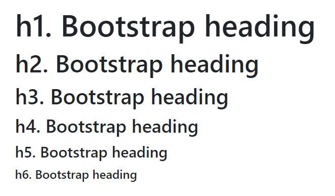
大标题和子级标题
Bootstrap直接覆盖了默认的<h1>、<h2>等标签,使其兼容自己的排版样式:
<div class="container">
    <h1>h1. Bootstrap heading</h1>
    <h2>h2. Bootstrap heading</h2>
    <h3>h3. Bootstrap heading</h3>
    <h4>h4. Bootstrap heading</h4>
    <h5>h5. Bootstrap heading</h5>
    <h6>h6. Bootstrap heading</h6>
</div>
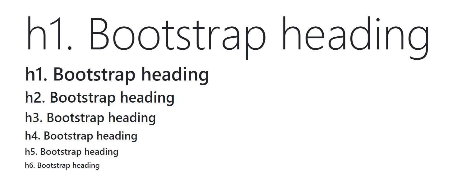
醒目标题
我们可以用display-1、display-2等制定一个特别醒目的标题,它通常用于宣传页面等。
<div class="container">
    <h1 class="display-1">h1. Bootstrap heading</h1>
    <h1>h1. Bootstrap heading</h1>
    <h2>h2. Bootstrap heading</h2>
    <h3>h3. Bootstrap heading</h3>
    <h4>h4. Bootstrap heading</h4>
    <h5>h5. Bootstrap heading</h5>
    <h6>h6. Bootstrap heading</h6>
</div>
副标题
副标题一般用作文章总标题的附属说明。
<div class="container">
    <h1>
        大标题
        <small class="text-muted">副标题</small>
    </h1>
</div>

正文
基础使用
正文使用<p>指定。
<div class="container">
    <p>Hello, world!</p>
</div>

中心内容
例如论文有一个「摘要」用来描述整篇文章写了什么,我们的页面有时候也要实现类似效果,这个通常是那个用于学术性,或是文字内容特别多的网页。
<div class="container">
    <h1>Title</h1>
    <p class="lead">Hello, world!</p>
    <p>This is a Bootstrap4 demo.This is a Bootstrap4 demo.This is a Bootstrap4 demo.</p>
</div>
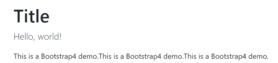
图中,夹在标题和正文之间的就是中心内容。
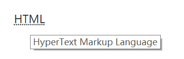
缩略语
一些专业性的学术文章都会有缩略语的备注,甚至专业名词附录。这个功能也可以实现到网页上。
<div class="container">
    <p><abbr title="HyperText Markup Language">HTML</abbr></p>
</div>
备注和引用
Bootstrap4中备注的样式似乎是改丑了。
<div class="container">
    <p>正文</p>
    <blockquote class="blockquote">
        <footer class="blockquote-footer">底部备注</footer>
    </blockquote>
</div>

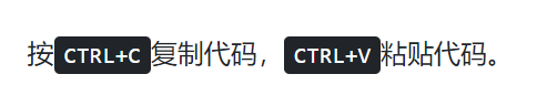
按键高亮
我们可以使用<kbd>标签高亮一些字符,指定这些字符代表键盘按键。
<div class="container">
    <p>按<kbd>CTRL+C</kbd>复制代码,<kbd>CTRL+V</kbd>粘贴代码。</p>
</div>
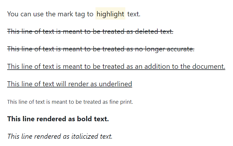
一些特殊效果
下面实现了关键字高亮、删除线、下划线等常用文字效果。
<div class="container">
    <p>You can use the mark tag to <mark>highlight</mark> text.</p>
    <p><del>This line of text is meant to be treated as deleted text.</del></p>
    <p><s>This line of text is meant to be treated as no longer accurate.</s></p>
    <p><ins>This line of text is meant to be treated as an addition to the document.</ins></p>
    <p><u>This line of text will render as underlined</u></p>
    <p><small>This line of text is meant to be treated as fine print.</small></p>
    <p><strong>This line rendered as bold text.</strong></p>
    <p><em>This line rendered as italicized text.</em></p>
</div>
当然这个比较鸡肋,因为直接用也非常方便,Bootstrap再封装一层除了看起来比较统一,没什么实际意义,我们一般都是直接调用HTML标签或CSS。
图片
响应式图片
响应式图片指定img-fluid,可以让图片根据父元素进行自动缩放,该缩放是等比例的。下面代码在栅格中放了一个图片,基于栅格的限制,该图片会被缩放。
<div class="container">
    <div class="row">
        <div class="col-lg-1">
            <img src="libs/images/1.jpg" class="img-fluid" />
        </div>
    </div>
</div>
图片圆角
rounded可以给图片加上圆角。
<img src="libs/images/1.jpg" class="img-fluid rounded" />

缩略图边框
img-thumbnail能给图片加上一个圆角线框,使其看起来像是缩略图。
<img src="libs/images/1.jpg" class="img-fluid img-thumbnail" />

图片的文字说明
figure用于给图片加上文字说明。
<figure class="figure">
    <img src="libs/images/1.jpg" class="figure-img img-fluid" />
    <figcaption class="figure-caption">hello, world</figcaption>
</figure>

作者:Gacfox
版权声明:本网站为非盈利性质,文章如非特殊说明均为原创,版权遵循知识共享协议CC BY-NC-ND 4.0进行授权,转载必须署名,禁止用于商业目的或演绎修改后转载。
Copyright © 2017-2024 Gacfox All Rights Reserved.
Build with NextJS | Sitemap