布局
布局是网页展示信息的大框架,也是CSS中最困难的地方,和大多数UI框架会提供一系列Layout组件不同,由于历史原因,网页布局是结合使用文档结构、元素盒模型、元素定位实现的,这篇笔记介绍CSS中常用的布局实现,包括传统的元素定位方式、浮动定位、和全新的Flex布局。
定位属性
CSS中,position属性用于指定元素的定位方式。
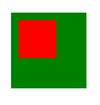
static 默认定位方式
static是position的默认值,也就是说,默认情况下,页面上的元素不会被特殊定位。从习惯上来说,除非要覆盖样式库,否则我们基本不会把position: static;显示的写出来。
<div style="
width: 100px;
height: 100px;
background-color: green;">
    <div style="
    width: 50px;
    height: 50px;
    background-color: red;
    position: static;"></div>
</div>

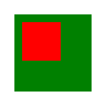
relative 相对父元素偏移
relative需要和这几个定位属性配合使用:top、left、right、bottom。如果不指定定位属性,relative和static的表现是一致的,指定定位属性后,会在原有基础上进行偏移。
<div style="
width: 100px;
height: 100px;
background-color: green;">
    <div style="
    width: 50px;
    height: 50px;
    background-color: red;
    left: 10px;
    top: 10px;
    position: relative;"></div>
</div>
fixed 相对页面固定位置
很多网页设计有固定顶部的导航,即使页面向下卷动,导航也始终保持在顶部,这是通过fixed定位方式实现的。和relative类似,fixed也是通过top、left、right、bottom这四个偏移属性指定位置。
上面是一个网页头部的fixed部分示例。
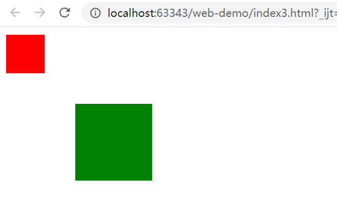
absolute 相对最近的非static祖先元素固定位置
从上面小标题的描述来看,就知道absolute这个属性有多奇葩,absolute的定位规则:寻找一个最近的非static父元素,相对它定位,如果没有找到这样的元素,则相对<body>定位,并且会随着页面卷动。
下面代码中,内部<div>会相对父<div>定位:
<div style="
    width: 100px;
    height: 100px;
    background-color: green;
    position: absolute;
    left: 100px;
    top: 100px;">
        <div style="
        width: 50px;
        height: 50px;
        background-color: red;
        position: absolute;
        left: 10px;
        top: 10px;"></div>
</div>
下面代码中,内部<div>会不顾父<div>,相对<body>来定位,乍看起来有点像<fixed>,但是要注意它不会固定在视口的一个相对位置,而是会随着文档卷动的。
<div style="
    width: 100px;
    height: 100px;
    background-color: green;
    margin-left: 100px;
    margin-top: 100px;">
        <div style="
        width: 50px;
        height: 50px;
        background-color: red;
        position: absolute;
        left: 10px;
        top: 10px;"></div>
</div>
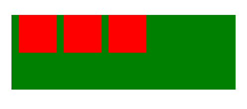
float 浮动定位
float可以实现浮动定位,浮动定位的元素会自动靠向一边进行排列。浮动定位能够实现流式布局、文字环绕图片等功能,比较常用。注意,浮动定位的写法类似float: left;这种,而不是position: float。
.container {
    width: 300px;
    height: 100px;
    background-color: green;
    margin-left: 100px;
    margin-top: 100px;
}

.item {

    width: 50px;
    height: 50px;
    background-color: red;
    float: left;
    margin-left: 10px;
}
<div class="container">
    <div class="item"></div>
    <div class="item"></div>
    <div class="item"></div>
</div>
float甚至可以和position: relative结合使用,这里就不多介绍了。
浮动定位高度塌陷问题
我们使用浮动定位float时,有时会发现,使用浮动的子元素无法再撑开父元素了。
这是一个没什么道理的规定。
例子代码:
<div style="width: 100%;background: green;">
    <!--设置了float的子div-->
    <div style="width: 80%; height: 50px; background: yellow;float: left"></div>
</div>
外层绿色的div直接消失了。
解决办法:
- 为父元素设置
overflow: hidden - 使用
height为父元素指定一个高度,不推荐 - 为父元素添加一个子元素
<div style="clear: both"></div>,可以清除浮动撑开父元素,产生了冗余标签,不推荐 - 通过伪类
:after,利用clear: both清除浮动,太麻烦了,不推荐
Flex布局
CSS3中,引入了全新的Flex布局,使用Flex布局能够很容易的实现传统布局模式难以实现的效果。参考资料:https://developer.mozilla.org/zh-CN/docs/Web/CSS/flex
Flex布局中,有清晰的容器和元素的概念,使用Flex布局,首先需要对容器元素指定display: flex;,然后分别对容器和元素配置一系列CSS属性。
容器
Flex容器包含许多元素,容器决定如何排列这些元素。
flex-direction 排列方向
flex-direction决定Flex容器中元素的排列方向,可选值:
row:默认,从左到右横向排布row-reverse:从右到左横向排布column:从上到下纵向排布column-reverse:从下到上纵向排布
flex-wrap 换行控制
flex-wrap决定在Flex容器排列方向上的换行方式,可选值为:
nowrap:默认,不换行,多个元素将被在对应排列方向上压缩wrap:换行wrap-reverse:换行,但第一行在下面,后续元素在上面
justify-content 排列方向上的对齐方式
justify-content指定排列方向上的对齐方式,可选值为:
flex-start:根据flex-direction定义的方向,向方向起点对齐flex-end:根据flex-direction定义的方向,向方向终点对齐center:在排列方向上居中space-between:左右元素在排列方向上分别紧靠左右边缘,其余元素均匀分布在中间space-around:元素均匀分布在中间,左右元素和容器边缘有一定边距
align-items 排列方向纵向的对齐方式
align-items指定排列方向纵向上的对齐方式,可选值为:
stretch:在排列方向纵向上以占满整个容器,默认值flex-start:根据flex-direction定义的方向纵向,向方向起点对齐flex-end:根据flex-direction定义的方向纵向,向方向终点对齐center:在排列方向纵向上居中(垂直居中)
元素
Flex容器中的单个元素可以决定自己占用多大空间,除此之外,还可以为自己单独指定一个对齐方式。
flex 一个元素的空间占比
flex属性其实是以下三个属性的合写:
flex-grow:元素的缩放比例,默认值为0,即不放大,如果指定一个小于1的值,元素将缩小flex-shrink:元素的被动压缩比例,当元素长度之和大于容器,所有元素将被压缩,默认值为1,即等比例压缩flex-basis:元素在flex容器中的理想高度,可以指定一个带单位的数值长度,默认值为auto
这几个属性可能乍一看起来比较费解,我们只要试试就明白了。
例子:这里利用flex属性实现一个类似栅格系统的效果,我们需要让5个元素均匀的占满父容器。
.container {
    display: flex;
    justify-content: space-between;
    border: 1px solid darkgray;
}
.card {
    flex: 1 1 auto;
}
.item1 {
    background-color: red;
}
.item2 {
    background-color: green;
}
.item3 {
    background-color: yellow;
}
.item4 {
    background-color: blue;
}
.item5 {
    background-color: skyblue;
}
<div class="container">
    <div class="card item1">测试内容</div>
    <div class="card item2">测试内容</div>
    <div class="card item3">测试内容</div>
    <div class="card item4">测试内容</div>
    <div class="card item5">测试内容</div>
</div>

align-self 单独设置纵向对齐方式
Flex容器中已经指定了元素的纵向排列方式,但是align-self还允许我们单独为一个元素指定它自己的纵向排列方式。可选值和align-items相同。