3D效果
之前章节我们介绍过CSS的2D平移、旋转、缩放变换,实际上CSS也支持3D变换。结合过渡和关键帧动画,3D能够实现很多炫酷的效果。
透视
学习过素描的都知道透视原理在绘画中的重要性,这是因为3D空间中的物体透视投影比正交投影更有立体感。CSS中主要通过perspective和perspective-origin设置透视效果。
- perspective:观察者与z=0平面的距离,指定非0值后会产生近大远小的透视效果,z>0时元素变大,z<0时元素变小
- perspective-origin:灭点的位置,可以使用百分比,也可以使用
center、top left等关键字
3D变换
CSS中的3D变换坐标方向如下:
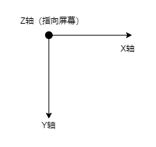
基于这套坐标系,我们可以对元素进行3D平移、旋转和缩放,变换使用transform属性实现。
translateX translateY translateZ
rotateX rotateY rotateZ
scaleX scaleY scaleZ
3D变换例子
下面例子中,实现了3张图片的类似层叠的3D效果。

<div class="container">
    <img src="images/1.png" alt="image1"/>
    <img src="images/1.png" alt="image2"/>
    <img src="images/1.png" alt="image3"/>
</div>
.container {
    transform-style: preserve-3d;
    position: relative;
    width: 300px;
    height: 300px;
    perspective: 1000px;
    perspective-origin: 50% 50%;
}

.container :nth-child(1) {
    width: 300px;
    height: 300px;
    border-radius: 3px;
    position: absolute;
    left: 0;
    top: 0;
    opacity: 0.95;
    transform: translateZ(0);
}

.container :nth-child(2) {
    width: 300px;
    height: 300px;
    border-radius: 3px;
    position: absolute;
    left: 0;
    top: 0;
    opacity: 0.95;
    transform: translateZ(-100px) translateY(30px);
}

.container :nth-child(3) {
    width: 300px;
    height: 300px;
    border-radius: 3px;
    position: absolute;
    left: 0;
    top: 0;
    opacity: 0.95;
    transform: translateZ(-200px) translateY(60px);
}
作者:Gacfox
版权声明:本网站为非盈利性质,文章如非特殊说明均为原创,版权遵循知识共享协议CC BY-NC-ND 4.0进行授权,转载必须署名,禁止用于商业目的或演绎修改后转载。